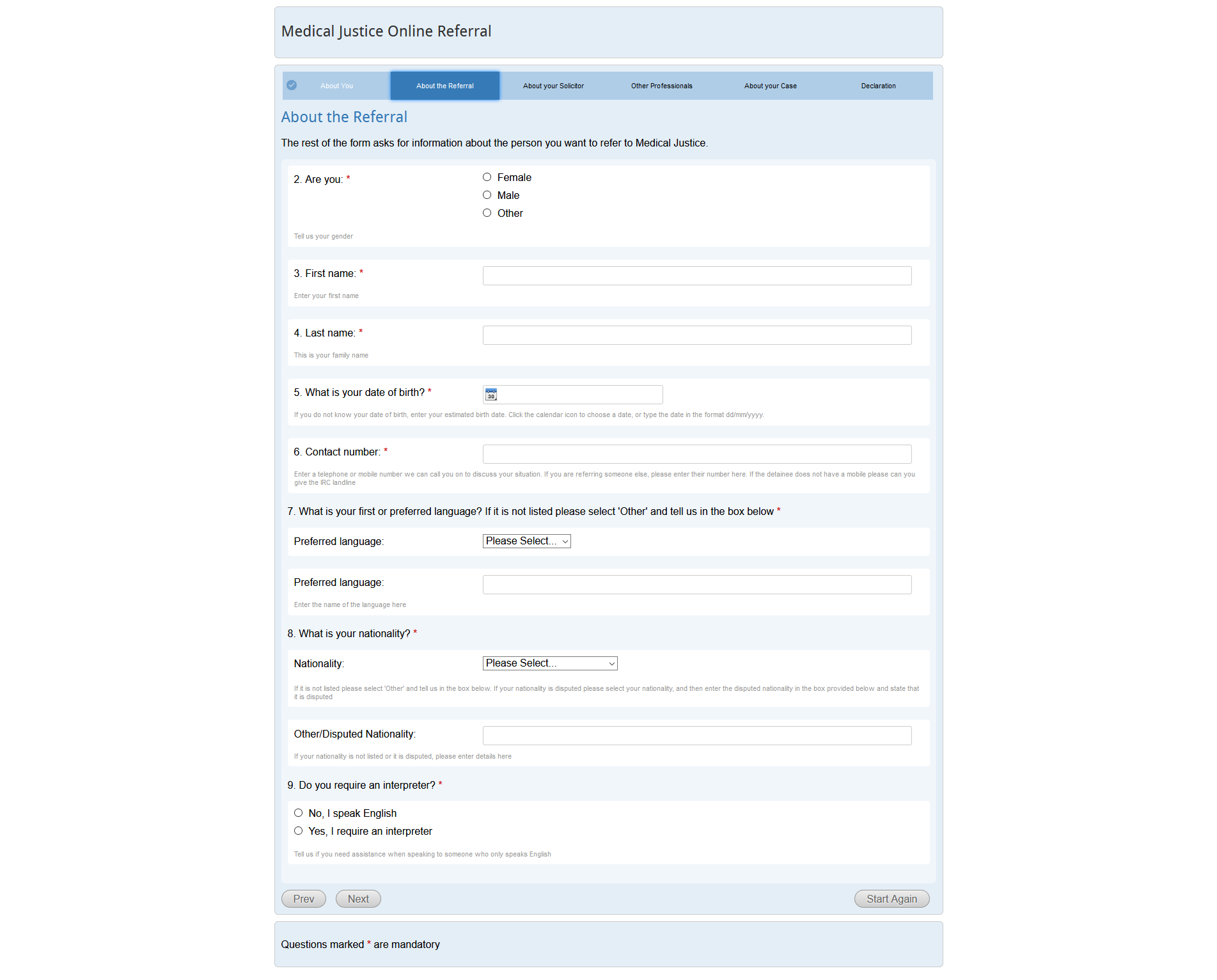
Redesigned a form as part of job application.

- Hard to read due to colour and font size (white on light blue background).
- I have added font colour that differentiates from background in more darker colours along with increasing font size.
- Boxes are not very obvious way of showing stage of the application, changed it with more obvious and commonly used circles where:
- done circle: navy blue background, tick sign, medium size.
- in progress circle: red background with another white circle inside of it, large size.
- not done circle: light blue, solid, small size.
- Previously supporting text appeared under label and input field.
- Hard to read due to small font size and light colour of font on white background.
- Added supporting text as placeholder where it was suitable or added below the form with dark and larger font.
- Made larger and customised to the website to make easier to click but also read.
- Too small text, icon has too similar colour to background.
- Increased in size and created more clear icon.
- Previously text about mandatory fields was at the bottom of the page after navigation buttons.
- Moved notification of mandatory fields above buttons so a user will read it before clicking.
- Small buttons with small text and similar text might make it hard to read.
- Not all users might know what's "prev". There are multiple questions about user language and knowledge of English langue, using "prev" might give misleading results if user uses google translate.
- Due to colour of button and background, visually impaired users might find it difficult to find buttons.
- Increased button size along with much darker colours. Used bold capital letters for ease of reading.
- Replaced "prev" with "back".
Name field showcases input field with text inside of it. Phone number field just showcases error message if user haven't filled out the mandatory fields. Display: 1920px