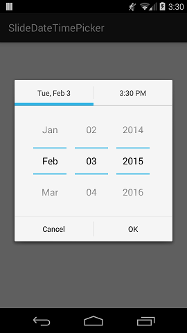
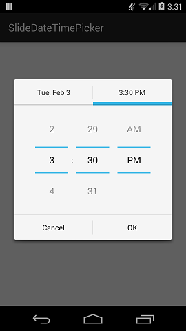
SlideDateTimePicker is an Android library that displays a single DialogFragment in which the user can select a date and a time. The user can swipe between the DatePicker and TimePicker, and the tab underline will gradually animate as the user swipes. The colors of the tab indicator and divider lines are customizable to fit your project's theme. Tested on Android 4.0+.
Eclipse/ADT:
From your main project, simply reference the SlideDateTimePicker library:
- Right click on your project name and select Properties.
- Select Android from the left column.
- Click Add.
- Select SlideDateTimePicker.
- Click Apply and then OK.
Android Studio: Coming soon.
(See SampleActivity for a more complete example)
First create a listener object:
private SlideDateTimeListener listener = new SlideDateTimeListener() {

    @Override
    public void onDateTimeSet(Date date)
    {
        // Do something with the date. This Date object contains
        // the date and time that the user has selected.
    }

    @Override
    public void onDateTimeCancel()
    {
        // Overriding onDateTimeCancel() is optional.
    }
};
Then pass the listener into the builder and show the dialog:
new SlideDateTimePicker.Builder(getSupportFragmentManager())
    .setListener(listener)
    .setInitialDate(new Date())
    .build()
    .show();
Note that the Date object that you pass in to .setInitialDate() should contain both the date and time that you wish to initially display.
To set the minimum date to display:
.setMinDate(date)To set the maximum date to display:
.setMaxDate(date)The default time format is the current device's default, but you can force a 24-hour or 12-hour time format:
To force 24-hour time:
.setIs24HourTime(true)To force 12-hour time:
.setIs24HourTime(false)The default theme is Holo Light, but you can specify either Holo Light or Dark explicitly:
.setTheme(SlideDateTimePicker.HOLO_LIGHT)or
.setTheme(SlideDateTimePicker.HOLO_DARK)To specify the color for the sliding tab underline (indicator):
.setIndicatorColor(Color.parseColor("#FF0000"))To specify the color of the horizontal divider lines in the DatePicker and TimePicker: You can also set a custom color for the horizontal divider lines in the DatePicker and TimePicker, but for this you have to paste your own version of selection_divider.9.png into the the library's drawable-xxxx folders that has your desired color. To do this, open selection_divider.9.png in a graphics editor, change the color, then paste your new files into the drawable-xxxx folders.
Contributions are welcome. Please open up an issue in GitHub or submit a PR.
- Builder methods now correspond to outer class methods
- Improved javadoc comments
- First release
Licensed under the Apache License, Version 2.0
SlidingTabLayout.java and SlidingTabStrip.java are Copyright (C) 2013 The Android Open Source Project and are licensed under the Apache License, Version 2.0
Thanks to Arman Pagilagan's blog post for the initial idea.